3 Column Layout
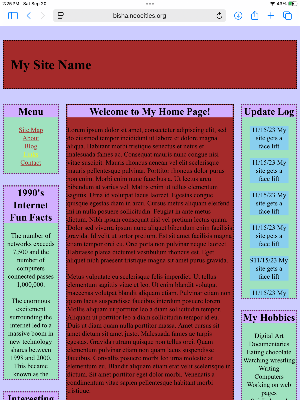
The classic 3 column page was everywhere in the late 90s and early 2000s. A logo at the top, navigation in the left sidebar, maybe an ad on the right, and content in the middle. Many of us first scrolled through pages like this; with a noisy dialup connection, guestbooks with comments, and hit counters that tracked our stats.
5 Grid Layout
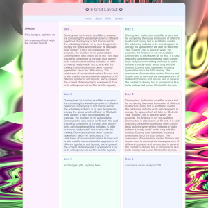
When CSS grids came along, the web suddenly looked more polished or avant garde. The 5 grid layout offered order and balance like a library catalog for blogs, writing, and about me sections. It felt progressive at the time because it had clean boxes that held thoughts, blurry jpgs or curated link collections.
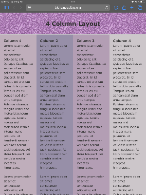
4 Column Layout
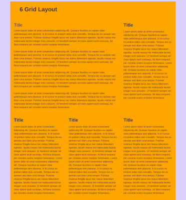
The 4 column design was a compromise between simplicity and complexity. It was practical but also gave us room to spread out. Text, images, and buttons didn’t overwhelm. This newspaper style layout reminds us of early fan sites, online zines, or journals. We experimented with structure before responsive design made things fluid.
The Transition
The web has moved from fixed layouts to the fluid flexibility of Flexbox and CSS Grid. Pages now adapt across mobile and desktop screens. But in that smoothness, some of the awkward charm of early layouts has been lost. Looking back at the 3 column, the 6 grid, and the 4 column is like flipping through an old photo album of the web. Design was clunky, experimental and full of personality.
Other Layouts
Other random designs include the archival layout organizes content into separate, self-contained blocks so information can be stored and revisited clearly over time. It emphasizes structure and hierarchy rather than continuous flowing text, making each section feel like an individual record, which is perfect for a personal webpage.
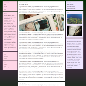
This 2 column layout uses a centered container with a fixed width, combining a decorative header bar and a twocolumn structure. The left sidebar is floated and holds navigation links, while the main content area is offset with a margin to sit beside it. Shadows, borders and hover effects can be added it make it pop.
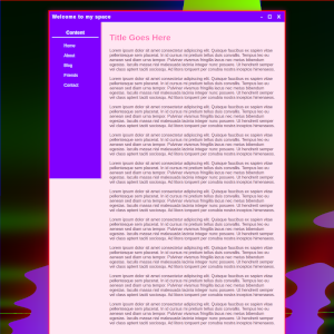
The busy grid layout is a design style that packs many elements like images, text, and graphics into a structured grid with little empty space. It creates a dynamic, energetic feel but can quickly become overwhelming if not organized intentionally. Hierarchy can keep the layout readable despite its density; but this is a fun one.
